The Screen
Intro to The Screen
Intro to The Screen
The Info Select screen includes the following important areas: the Selector, the Workspace, the Menu Ribbon, the Quick Access Toolbar, the Context Pane and the Status Bar. This section describes the location and function of these areas.
Selector
The Selector
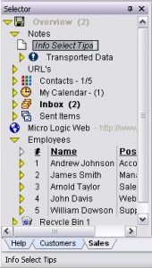
The Selector is the outlining area initially located on the left side of the Info Select screen. The Selector shows a summary of your information in list or outline form. Some information is supplied to you in the Selector when you install Info Select. You use the Selector to:
- Organize your information
- Select items for viewing
- See a quick overview of your data
- Create an outline
Each line in the Selector shows an icon, indicating the type of information. The basic types of data are listed here.
In the Selector, to the right of each icon is a text heading or caption for the item. A quotation mark (“) at the beginning of a caption indicates the caption was created from the first line of body text of the item. This is called a literal caption.
It is important to set the Selector width according to your preference.
[:] To set the width of the Selector:
Drag the right edge of the Selector to the right or left to increase or decrease its size.
The Selector automatically resizes depending on the current type of data (provided Menu Ribbon | Home | Options | View | Selector | Change Selector width automatically for optimum viewing is checked). You can set the minimum Workspace width to ensure that the Workspace is not hidden completely. For this purpose, set the desired minimum width in pixels in the Menu Ribbon | Home | Options | View | General | Minimum workspace width box.
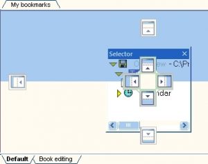
Info Select 10 allows you to position the Selector window at any desired location on the screen, and have the Selector window docked on the left, right, top or bottom location. The Selector window can be also completely hidden, or made available as a pop-up window.
[:] To position the Selector window on the Screen:
- Click the caption of the Selector window
 and drag it to the desired position.
 - If you want to dock the Selector window to top, bottom, left or right position, position the mouse cursor while dragging the Selector window onto one of the docking markers. The area where the Selector will be docked will be highlighted as shown on the image below. Release the mouse button to dock the Selector window.
- Click the X button on the Selector window caption to completely hide the Selector window, or click the
 button to automatically hide the Selector window when it is not needed. Click Show Selector icon at the top right corner of the Info Select screen to show the Selector window again.
The Overview line
The first line of the Selector shows a special file called Overview.wd3. This file is the starting point for all your data. This file cannot be hidden because it must be selected to perform “group” operations that affect all your data. You can change the caption name. All information in the Selector is indented below Overview. The Overview is analogous to the root directory of your hard disk, which also cannot be removed.
Workspace
The Workspace
The Workspace is the main area located on the right side of the Info Select screen. The Workspace displays the contents of the item highlighted in the Selector. Data is entered and edited in the Workspace. For example you might locate a memo listed in the Selector, click on it to select it, and then view or edit the Memo body in the Workspace.
In Info Select 10 the Menu Ribbon will contain the buttons that are applicable to the selected item. For example, when editing a Note a Note tab with the Word Processing buttons will appear; for an e-mail message the E-mail tab on the Menu Ribbon will contain Send, Reply, Forward and other buttons.
Click here for more information about the Menu Ribbon.
Menu Ribbon
The Menu Ribbon
The Menu Ribbon located on the top of the Info Select screen replaces the menu and toolbar and provides controls for most of the application functions. The Ribbon is designed to help you quickly find the commands that you need. Commands are organized in logical groups under tabs. Each tab relates to a type of activity, such as writing or laying out a page. Some tabs are shown only when needed. For example, the Note tab is shown only when a Note is selected.
To determine what a Menu Ribbon button does, point to it with your mouse. A short description (tool tips or hover tip) is provided below the button.
Some commands on the Menu Ribbon are grouped under a single icon that shows a small triangle. Click on the triangle to display the list of sub-commands.
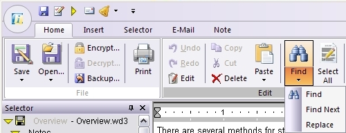
In addition to the toolbar buttons you will usually see a Tickler Bar, a Color Palette and the Folder Tabs. Click on each link to learn more about these buttons.
It is not possible to customize the appearance of the Menu Ribbon. However, you can use the Quick Access Toolbar to create a set of commonly used buttons.
One button on the Menu Ribbon deserves special mention. The Filter button indicates when the Search Filter is active. When you see the button in the “pushed” state and the color has changed to orange, you know you are viewing only items in the Search Filter and not all your data is displayed. To view all of your data click the Filter button to turn the filter off.
Quick Access Toolbar
The Quick Access Toolbar
The Quick Access Toolbar is a customizable toolbar that contains a set of commands that are independent of the tab that is currently displayed. The Quick Access Toolbar can be positioned on one of the two possible locations, and can be customized to provide access frequently used commands. For example, you can add buttons that represent printing the current item or displaying the Calendar window.
The Quick Access Toolbar can be located in one of two places:
- Upper-left corner next to the Info Select Button
 (default location)
 - Below the Menu Ribbon
[:] To change the location of the Quick Access Toolbar:
- Click Customize Quick Access Toolbar
 .
. - In the list, click Show Below the Ribbon or Show Above the Ribbon.
You can add a command to the Quick Access Toolbar directly from commands that are displayed on the Menu Ribbon.
[:] To Add a command to the Quick Access Toolbar:
- On the Menu Ribbon, click the appropriate tab or group to display the command that you want to add to the Quick Access Toolbar.
- Right-click the command, and then click Add to Quick Access Toolbar on the shortcut menu.
Notes :
- You cannot increase the size of the buttons.
- You cannot display the Quick Access Toolbar on multiple lines.
- Only button commands can be added to the Quick Access Toolbar – not lists such as indent and spacing values
Tip: You can quickly access the Quick Access Toolbar commands by pressing ALT+Number of the button on the toolbar. For example, ALT+3 will launch the command associated with the third button on the Quick Access Toolbar.
Status Bar
The Status Bar
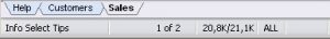
The Status bar is located at the bottom of the screen and provides a variety of information (listed from left to right):
When not editing:
- The caption of the selected item or a message about the progress of a command.
- The numeric position of the selected item in the current Topic and the total number of items in the Topic.
- Size of the selected item in characters.
- Viewing mode: ALL specifies a view of the full Selector contents. FILT specifies a view of only items matching a Search command.
When editing:
- The caption of the selected item or a message about the progress of a command.
- The row, column, and page where the cursor is currently positioned.
- The size of the highlighted item in characters.
- INS = Insert mode; OVR = Overwrite mode.
The Status bar also contains the “New Mail”  , “Alarm”
  and “Special messages”
  icons, and may show current date and time (provided Menu Ribbon | Home | Options | Toolbars | General | Display Date and Menu Ribbon | Home | Options | Toolbars | General | Display Time options are enabled).
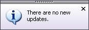
Info Select 10 may display special error and information messages on Status Bar (shown in the rollup window). Such messages appear when an error occurs in the background (for example, when Info Select is set for automatic e-mail delivery and an error occurs) or to inform about result of some operation that was done in the background (for example, when Info Select is set for automatic checking miclog.com for updates and no update was found). Click on such messages to see a detailed explanation. All special error and information messages are saved, so when the “Special messages” icon turns red  you can click on it to view the list of all error messages. Once you review the error message it will be deleted from list.
The Status bar may also display progress bars when sending or receiving e-mail.
Context Pane
The Context Pane
The Context Pane is located at the bottom of the Info Select application window, right above the Status Bar. It allows you to switch between different Contexts in one click.
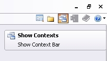
To show or hide the Context Pane, check or uncheck the “Show Contexts” button in the right top corner of Info Select window or the Menu Ribbon | Home | Options | Toolbars | General | Context Pane option.
To quickly hide the Context Pane, right-click on it and choose Hide in the pop-up menu.
Click here for more information about the Context Pane and it’s features.